I found Brian Shaler through Twitter. Brian likes to visualize and recently dabbled with the Digg API as part of a contest to visualize the activity in that community. His Digg Radar app was eye-catching, even if it apparently didn’t win.
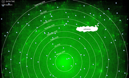
The Digg Radar is a visualization showing how diggers fit into the community
Digg Radar is a visualization that takes the stream of members using Digg to find great content on the web and puts them inside a cloud, where proximity to center indicates long-time members. Mousing over one of the digg icons will identify the user, and clicking will reveal details about the stories. The underlying assumption is that those who have been digging longer than others have more useful information; you are visually instructed to pay more attention to what is happening in the middle. Shortcomings include a lack of information about how these digs relate to each other or what the significance is when two members of approximately the same account age appear on the opposite sides of center. The visualization isn’t cumulative, which is a big plus in some respects since that keeps the amount of information on the screen somewhat manageable. Perhaps using shades of gray or colors to indicate the number of diggs in the past day would be an improvement.
The contest ended May 30. Brian’s Wheel of Upcoming entry came in fourth.
The Winners
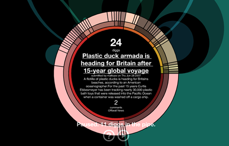
Of the three contest entries that did get dugg the most, I’m baffled how Digg Charts could be seen as very useful. It is essentially a filtered Excel spreadsheet with two related graphs. If those graphs—particularly the long one at the bottom showing various metrics over time—revealed some distinct patterns of stories, it would be a nice way to view the shape of the graph and understand if it is a story worth reading. But I didn’t see that in the limited articles available through the tool (which was partly masked on my smaller laptop screen).
Digg Expose is more promising. It allows for four different arrangements of the Snap thumbnails, popping the new Diggs into the queue based on popularity or upcoming stories and sorted by date, diggs or comments. The Play mode is not effective, though, as it moves through the queue almost too quickly to read and doesn’t stop quickly enough. I prefer the simple manual control of that navigation. The Snaps never caught up, either, meaning all of the visual information was lost for me.
The winner—the idea with 2,601 diggs—was Digg City, a little bitmappish grid city as a metaphor to show stream activity. The diggers move along the streets to where buildings are constructed as they stop by. The taller the building, the bigger the Digg. Unfortunately, the people don’t have any information about the user and the buildings never seem to get torn down and replaced with new info.
Digg Labs
The best Digg visualizations are the ones the Lab created. Big Spy, a running stream of dugg story titles with larger text meaning more popularity, is effectively rendered redundant by the superior Digg Stack. Stack shows the diggers as falling drops that collect into a bar chart of top stories. The bars turn from gray to green or red as they add diggs. Underneath runs a truncated version of Big Spy, sans text size differences. It also has a zoom feature to focus attention on different parts of the daily queue and a filter to show only the newest stories (probably the best way to see what is new in the stream).
Digg Swarm is a bit confusing, mainly because a lot of the information disappears too quickly. Stories are represented as free-floating nodes in this network soup, with users attaching themselves to the stories when they digg it. There are some cues of how stories may be related, too, although it is fleeting. Nodes are sometimes shown to connect with lines of varying thickness, presumably indicating that the number of times the same users have dugg both stories. There is a little physics added to that brief connection, which causes like stories to congregate together. The larger the link, the stronger the pull. Without mousing over the constantly-moving visual, though, it is very difficult to understand what you are looking at.
Rings are levels of categorization and sectors indicate popularity for this Digg visualization.
The best of the best is the Arc. With graphics that look like a combination of The Electric Company and The Partridge Family, this visualization is a rotating wheel divided into rings and sectors. The rings represent two levels of categorization and the articles themselves. The size of the sectors are an indication of popularity. The funky colors in the background are created through the strength of links between stories. Very intuitive and fun to explore.