Maps are obviously very important to content involving locations. No site purporting to be about a town or city would be as useful without a map. But the map metaphor can be used for other information, too. Even straightforward road maps may be more informative by changing perspective or rearranging convention.
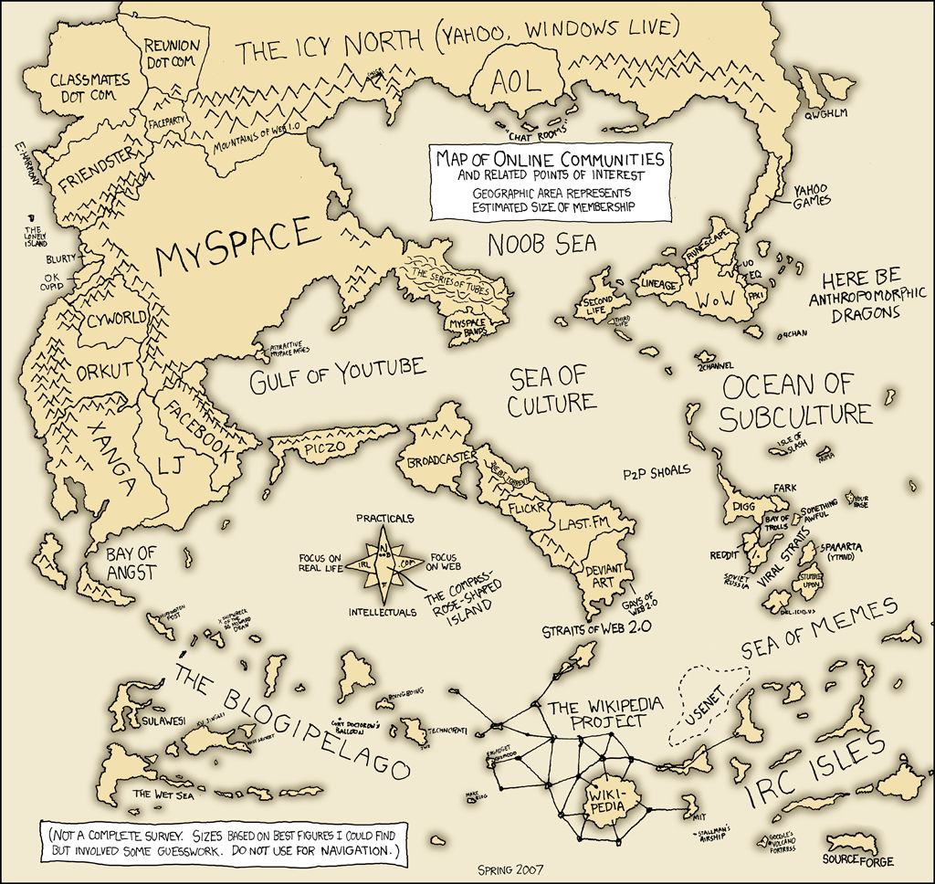
The above map (thank you, Kynthia) originally comes from Randall Munroe’s XKCD web comic. It is basically an affinity diagram, a common and effective tool for designers. It replaces geographical directions—north, south, east and west—with two spectra of categorization for online communities. In the horizontal axis is the area of focus, from real life to the Web. In the vertical axis is user mindset, from practicals to intellectual (which might be better termed “theoretical” or “technical” in their use). In the four quadrants created by those dimensions are situated examples of current online communities, circa spring 2007.
The clever use of the map metaphor turns the simple coordinate system into an atlas. Doing so allows the reader to visualize the relationship between these communities as a trip, places that have distance between them and need to be navigated. Simply listing Blurty with MySpace and Wikipedia wouldn’t tell anyone how they compare, whereas showing them on a map does.
As part of my early design research for Kosmix, I poured through a couple resources to compile a list of inspiring examples of how maps and the map metaphor can be used to heighten knowledge transfer. Below are some highlights:
- World Map proportioned by Poverty—Changes in size of North America and India are particular compelling, when compared to the standard maps of the world most people know. Similarly, see World by Population.
- Thesis Concepts as Metro Map—All of the points of exploration that went into a doctoral thesis are related to each other through a metro map, as if they were stops on a transportation line. Namahn (a design firm from Belgium run by Joannes Vandermeulen, who came to speak at IU a year ago) has a similar poster, called ““The User-Centered Design of Digital Products.”
- Exports as a Floorplan—The movement of exports from one country to another is shown as foot traffic from room to room.
- Knowledge Discovery of Literature—Starting with “migraine” and listing all of the related terms in the literature, this map shows how that leads to reasonably related literature for fatty, kinetic, Magnesium, prostaglandin, and cholesterol (from An interactive system for finding complementary literatures: a stimulus to scientific discovery by Don Swanson and Neil Smalheiser). This is potentially an interesting way to frame a design exercise, but it could also be used to show relations in topics and categories.
- World arranged in shape of Manhattan—As a way of illustrating how diverse New York is, the world countries are arranged into the shape of the island of Manhattan. Perhaps a bit abstract, this map leverages a known (though probably mostly local) visualization to distort another known model and thus show how they are related.
- New Perspective—The angle of this photo is more like how someone would travel. Changing the perspective helps improve GPS devices in vehicles, and it might be interesting to explore for the web. Google Earth allows a user to explore this somewhat, although at a map-level perspective the images have no height.
- World Map by Governance—Not sure what the parameters are, but the longitude and latitude of the world map are replaced with those criteria to show relationships between how nations are governed.
- Knowledge Domains as Geography—The things geographers know are visualized as hills, valleys, land and water … more things geographers know.
- Newsgroups as a Platte Map—Using two metrics (volume and change from previous volume), this map shows the focus of newsgroup usage. In laying it out as something similar to a platte map, however, there are some incongruent cognitive models at work. Green is good, red is bad in terms of the metric of change, but green is pure and red is developed in a urban model. Similarly, the larger sections are more important in this map, but in an urban map they indicate wide-open spaces.
- Lewis Carroll’s Ocean Chart—An example of an intentionally uninformative map.
7 replies on “The Map Metaphor”
Here are a few more, courtesy of A Beautiful WWW:
yet another one, from a Google blog
Another one, courtesy Tyler …
The world according to the US
Here’s another interesting one … U.S. Religious Adherents
Here’s another great one, posted on Go2Web2, that shows the Internet services and communities as a New York Subway map.
[…] is a great one. I’m adding it to my list! Posted 5 minutes ago. ( permalink […]
[…] you like that one, follow through some of the links at this post. This metaphor has been nicely used in the past to illustrate the process of design and […]