Not so long ago, Digg challenged its community to a contest to make use of the Digg API to feed creative and dynamic Flash visualizations. Digg Radar, a visualization of new diggs created by Brian Shaler and profiled here in the summer, was one of the entries that tried to move the news stream out of the standard most-popular list format that is the default of the site.
Although Twitter has not yet issued a similar challenge, their open API is already being used by some developers to examine the information stream in new ways.
Paul Rand describes the language of form
The language of form
Late graphic designer Paul Rand is best known for his corporate logo work for entities like Westinghouse, UPS, ABC, Next Computer, Yale University, Cummins Engine and IBM. A tribute film, archived on Adland, was created for his posthumous induction to the One Club Hall of Fame in 2007. In the four-minute short film, Rand talks about the relationship between content and form:
When you say design, everybody has their definition that doesn’t correspond to yours. There are many good definitions. One is the synthesis of form and content. In other words, without content there is no form, and without form there is no content.
A work of art is realized when form and content are indistinguishable. When form predominates, meaning is blunted. But when content predominates, interest lags. The genius comes in when both of these things fuse.
source: transcript of One Show – Paul Rand Tribute Film (2007)
Rand also goes on to describe the language of form: order, variety, contrast, symmetry, tension, balance, scale, texture, space, shape, light, shade, and color. These are the core building blocks that go into visual design. While the Twitter community has not yet reached a point where this language has been mastered, the more effective visualizations that are out tend to use these blocks to create or reveal new meaning.
Understanding the value of tweets
When it comes to Twitter, the content are the 140-character posts about the details of life—tweets—and the form is the information stream. The nature of the stream points to opportunities for good visualization to add value.
Microblogging content for a single individual comprises nothing more than a longitudinal diary. For an author filling her own stream, everything is already known before it is posted. There is no new information to be gained. The relevance is high, but the information entropy is low. By comparison, the public stream—containing all member tweets—is noisy and lacks context. Since almost every tweet contains new information, the entropy is high. However, the relevance is low.
The sweet spot in between is the personal information stream, comprised only of a member’s own tweets and those of the people she chooses to follow. Particularly when the in-degree (followers) and out-degree (following) are comparable, the tweets in the personal information stream are highly relevant with high information entropy. In other words, any investment in time to acknowledge new information will be seen as worthwhile. This is where most users spend their interaction resources on the site, whether by checking the Twitter web site or using a third-party access tool, like Twitterrific.
The biggest opportunities for visualization, therefore, involve finding ways to draw new information out of one’s own known personal tweets and extracting relevant information out of the torrent of public tweets.
TwitterMatrix views recent tweets from a Neo perspective.
Drawing new information
Among the earliest visualizations of the public timeline was TwitterVision. It uses a world map with the location information in the authors’ profiles to situate tweets in geography. TwitterFaces, Twitter Planet and Twitter Earth do this as well, albeit with different map platforms. Twitter Map places a permanent pin on Google Map, showing only the most recent tweet of each member. This was interesting because it leveraged an available but hidden bit of information—author location—and presented it in a way that was more engaging. Reading the individual tweet content requires a lot of filtering to find the relevance, but it is inherently easier to identify with a place. The map visualizations, though, require constant attention in order to benefit from the revealed information.
Twitter Poster is an example of an attempt to create new information through visualization. This site keeps track of the most central members of the community and uses their profile icons to create a poster graphic. Different sizes are used to indicate how important the author is in the twitosphere. This aggregation of user statistics has been done in several ways by other services, but those all use a spreadsheet or table presentation rather than letting the top member images do the talking.
Another example is Twitterverse, a web site that generates a tag cloud reflecting the current pulse of recent author posts. Twitterverse creates such clouds for both single word and two-word phrases. These kinds of visualizations invite short user sessions with return visits, rather than being something to monitor constantly.
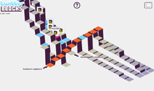
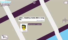
In-house development by Twitter is limited but high quality. In late August, TechCrunch got early screenshots of Blocks, a Twitter visualization created by people who worked on Digg visualizations. Blocks displays the local neighborhood of personal information streams that connect to recent posters among those you follow. The top surfaces of the stacks are color-coded to differentiate between you and your followers. By clicking and dragging the screen, the entire block structure can be spun and examined from all angles. Each branch can be traversed to see the individual tweets of your neighbors, and other twitterers can be clicked to regenerated a new stream neighborhood built from that member. Blocks is a highly interactive tool for discovery of both content and other members.

TwitterMosaic uses member profile images as material for mosaic art.
Relevance of content
There are several services and resources leveraging the API access to improve personal relevance in the noisy public timeline. Twitter only allows filtering of the public information stream in one way: by deciding who to follow. Absent are ways to arrange content for specific contexts by building streams for specific groups or topics. That task is left to third-party development.
Twitter Digest allows personal information streams to be created from a list of usernames. For instance, the Makice family has a digest that is being used to help archive our microblogging by creating a daily snapshot of what we posted. This service addresses the issue of grouping users and control of the timeframe for viewing content, but otherwise it doesn’t add much value over the following function already in Twitter.
TwitterWhere, on the other hand, creates RSS feeds based on location of the authors. There is no way to do that through the Twitter site tools. Following Bloomington, Indiana, for example, is a way of discovering new local users, provided member profiles are first updated with a valid location. The in-house tools that come closest to providing this functionality are search and tracking. Search is a manual process that forces one to wade through pages of results to look for new matches. Tracking is currently only alerting a member to keyword matches through an IM channel, which is typically not the preferred means of interacting with Twitter.
There are a number of tools focusing on the text of the tweets. Initially launched in early October, Random Tweets uses a combination of computer randomness and human oversight to identify the ten best tweets of the day. TwitterBuzz and Twitigg look at the links authors embed in their posts, aggregating the appearances of popular URLs and allowing them to rise to the top of the list. Twitigg extracts links, resolving the shortened URLs first to show what links are popular by the hour and day. The site also separates forms of media. TwitterBuzz is largely viewing noise, however, given that TinyURL—the built-in integration that shortens long URLs posted in tweets—shows up at the top of the list.
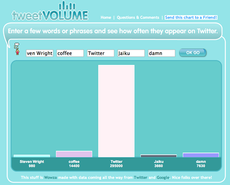
TweetVolume is a simple bar chart comparing the frequency of keywords in tweets.
Situated visualizations
Artist Ben Rubin and UCLA professor and statistician Mark Hansen created a multi-media permanent art installation for the The New York Times headquarters building on Eighth Avenue and 41st Street. Dubbed “Moveable Type,” this visualization is about the physical space as much as the content flowing on its 560 small screens.
Two walls of monitors have been programmed to display snippets from both the Times archives and live feeds going into publication that day. Casual passers-by may notice the refreshing of text in patterns without understanding how the content relates to each other. That kind of understanding is only possible by moving in closer an spending time with the screens. There is also a clickety-clack of old teletype machines, bringing a notable ambiance to the newspaper offices. Because the content reflects the activity, both historic and current, taking place in the building, there is a sense about the physical space that might not be understood without the visual and audible presentation.
Twitter development is possibly moving in that direction. The high relevance-entropy of small streams is ideal for connecting local communities in a meaningful way. These connections will undoubtedly take place in different locations around the same town, perhaps revolving around smaller groups of Twitter authors posting from the same physical spaces. Visualizations—like the one we are currently designing for the IU School of Informatics—will have the dual role of connecting the larger community through the exchange of status awareness and imbuing a specific building with an identity unique to the collection of people working there.
Situated visualizations are meant to be seen by those attached enough to the room to visit, and therefore both the content and form should aim for the highest possible relevance for that particular context.
The New York Times display, Moveable Type, pays attention to physical spaces.